
Introduction: Design That Converts
Turning visitors into customers requires designing every screen around the psychology of how people actually decide, not just how a page looks. Strategic UX/UI design — clear visual hierarchy, low-friction forms, credible trust signals, and deliberate calls to action — consistently outperforms visually polished sites that ignore these principles. Many businesses invest heavily in stunning visual design, only to wonder why their conversion rate remains stubbornly low; the truth is that aesthetics alone don't drive conversions. Conversion rate optimisation (CRO) should be built into the design process, not added later. Every design decision — from button placement to colour choices — impacts how users interact with your site and whether they take the actions you want.
"Good design is obvious. Great design is transparent." — Joe Sparano
This comprehensive guide will show you how to design websites that not only look beautiful but also convert visitors into customers, covering the psychology of conversion, key design principles, and actionable strategies.
The Psychology of Conversion Design
Understanding User Behaviour
Users make decisions based on a combination of rational and emotional factors. Understanding these drivers helps you design experiences that guide users toward conversion:
| Factor | Impact Level | Design Solution | Example |
|---|---|---|---|
| Trust | High | Social proof, testimonials, security badges | "Trusted by 500+ clinics" |
| Clarity | High | Clear CTAs, simple navigation, obvious next steps | "Book Your Free Consultation" |
| Speed | Medium | Fast loading, instant feedback, progress indicators | Loading animations, form validation |
| Emotion | Medium | Compelling imagery, colour psychology, storytelling | Before/after galleries |
| Friction | High | Simplified forms, fewer steps, guest checkout | Single-field email capture |
| Urgency | Medium | Limited availability, countdown timers | "Only 3 slots remaining this week" |
| Authority | High | Credentials, certifications, expert endorsements | "GMC Registered Practitioners" |
The Conversion Funnel in Design
Every page should guide users through the AIDA framework:
| Stage | Goal | Design Elements |
|---|---|---|
| Awareness | Capture attention | Compelling headlines, hero images, value proposition |
| Interest | Engage with content | Benefits-focused copy, relevant imagery, scannable layout |
| Desire | Build want | Social proof, testimonials, before/after results |
| Action | Convert | Clear CTAs, simplified forms, trust signals |
Cognitive Load and Decision Making
Users have limited mental capacity. Reduce cognitive load to increase conversions:
- Hick's Law - More choices = longer decision time = fewer conversions
- Miller's Law - People can hold 7±2 items in working memory
- Von Restorff Effect - Distinctive elements are remembered better
- Serial Position Effect - First and last items are remembered best
Key UX/UI Principles for Conversions
1. Visual Hierarchy
Guide users' eyes to what matters most through strategic use of design elements:
| Element | Effect | Application |
|---|---|---|
| Size | Larger elements draw attention first | Make CTAs larger than surrounding elements |
| Colour | Contrast highlights important elements | Use accent colour for primary CTAs |
| Position | Above-the-fold content gets seen | Place key messages and CTAs in prime positions |
| Whitespace | Isolation emphasises importance | Surround CTAs with breathing room |
| Typography | Bold text draws the eye | Use weight and size to create hierarchy |
| Imagery | Faces and directional cues guide attention | Use images that look toward CTAs |
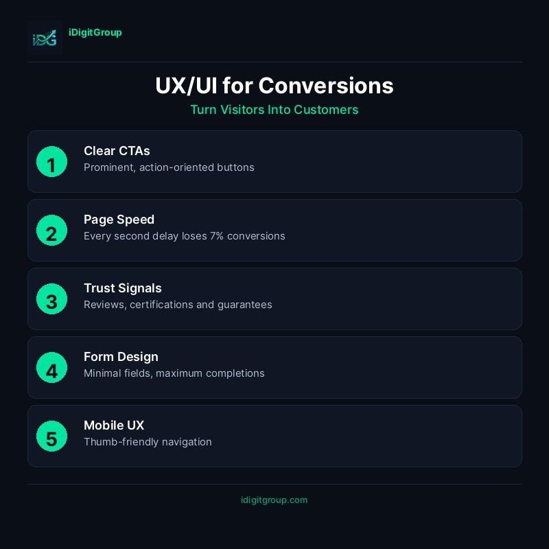
2. Call-to-Action Design
CTAs are the most critical conversion elements. Design them for maximum impact:
CTA Design Checklist
| Element | Best Practice | Why It Works |
|---|---|---|
| Colour | High contrast with background | Stands out visually |
| Size | Large enough to tap on mobile (min 48x48px) | Easy to interact with |
| Text | Action-oriented, specific | "Get Your Free Audit" beats "Submit" |
| Position | Above fold, end of sections, sticky | Visible when users are ready |
| Shape | Rounded corners, button-like | Looks clickable |
| Whitespace | Surrounded by space | Draws attention |
CTA Copy That Converts
| Weak CTA | Strong CTA | Why It's Better |
|---|---|---|
| Submit | Get My Free Guide | Specific benefit, ownership |
| Click Here | Start Your Free Trial | Action + value |
| Learn More | See How We Helped 50+ Clinics | Social proof + curiosity |
| Contact Us | Book Your Free Consultation | Specific, valuable action |
| Buy Now | Claim Your 20% Discount | Urgency + value |
3. Form Design for Conversions
Forms are often where conversions happen—or fail. Optimise every element:
Form Optimisation Strategies
| Strategy | Impact | Implementation |
|---|---|---|
| Reduce fields | High | Only ask for essential information |
| Single column | Medium | Easier to scan and complete |
| Inline validation | Medium | Immediate feedback reduces errors |
| Progress indicators | Medium | Shows users how much is left |
| Smart defaults | Low | Pre-fill where possible |
| Mobile optimisation | High | Appropriate input types, large tap targets |
Form Field Reduction Impact
| Number of Fields | Typical Conversion Rate |
|---|---|
| 3 fields | 25% |
| 5 fields | 20% |
| 7 fields | 15% |
| 10+ fields | <10% |
4. Trust Signals and Social Proof
Build confidence through strategic placement of trust elements:
| Trust Signal | Placement | Impact |
|---|---|---|
| Customer reviews | Near CTAs, product pages | High |
| Testimonials | Throughout site, especially landing pages | High |
| Case studies | Service pages, dedicated section | Medium |
| Client logos | Homepage, above fold | Medium |
| Security badges | Checkout, forms | High for transactions |
| Certifications | Footer, about page, service pages | Medium |
| Media mentions | Homepage, about page | Medium |
5. Mobile-First Conversion Design
With over 60% of traffic coming from mobile, mobile conversion optimisation is essential:
Mobile UX Checklist
- ☐ Touch-friendly buttons (minimum 48x48 pixels)
- ☐ Thumb-zone optimised CTA placement
- ☐ Simplified navigation (hamburger menu)
- ☐ Click-to-call phone numbers
- ☐ Autofill-enabled forms
- ☐ Appropriate keyboard types for inputs
- ☐ Fast loading (under 3 seconds)
- ☐ No horizontal scrolling
- ☐ Readable text without zooming (16px minimum)
Conversion-Focused Page Templates
Landing Page Structure
| Section | Purpose | Key Elements |
|---|---|---|
| Hero | Capture attention, communicate value | Headline, subhead, CTA, hero image |
| Problem | Agitate the pain point | Relatable scenarios, emotional copy |
| Solution | Present your offering | Benefits, features, how it works |
| Proof | Build credibility | Testimonials, case studies, logos |
| Objections | Address concerns | FAQ, guarantees, risk reversal |
| CTA | Drive action | Clear, compelling call-to-action |
Service Page Structure
| Section | Purpose | Conversion Element |
|---|---|---|
| Hero | Introduce service | Primary CTA |
| Benefits | Why choose this service | Secondary CTA |
| Process | How it works | Reduce uncertainty |
| Results | Proof of effectiveness | Case studies, before/after |
| Pricing | Transparency | Pricing CTA |
| FAQ | Address objections | Reduce friction |
| Final CTA | Last chance to convert | Strong closing CTA |
Measuring Conversion Success
Key Metrics to Track
| Metric | Target | Tool |
|---|---|---|
| Conversion Rate | 2-5% (varies by industry) | Google Analytics |
| Bounce Rate | <40% | Google Analytics |
| Time on Page | >2 minutes | Google Analytics |
| Click-Through Rate | >2% for CTAs | Heatmaps |
| Form Completion Rate | >50% | Form analytics |
| Cart Abandonment | <70% | E-commerce analytics |
A/B Testing Priority
Test these elements in order of impact:
- Headlines - Highest impact, easiest to test
- CTAs - Button text, colour, placement
- Forms - Number of fields, layout
- Images - Hero images, product photos
- Social proof - Placement, format
- Page layout - Section order, structure
Case Study: Conversion Optimisation Results
A recent aesthetic clinic website redesign achieved:
| Metric | Before | After | Improvement |
|---|---|---|---|
| Conversion Rate | 1.2% | 4.5% | +275% |
| Bounce Rate | 68% | 38% | -44% |
| Form Completions | 45/month | 180/month | +300% |
| Time on Site | 1:20 | 3:45 | +181% |
| Mobile Conversions | 0.8% | 3.2% | +300% |
Conclusion: Design for Results
Great UX/UI design balances beauty with functionality. Every element should serve a purpose and guide users toward conversion. The most successful websites are those that understand their users, reduce friction, and make taking action irresistible.
Remember: Design is not just about how something looks—it's about how it works. A website that converts is worth infinitely more than one that simply looks pretty.
Ready to increase your conversion rates? Our web design team specialises in conversion-focused design that delivers measurable results. Contact us for a UX audit and discover how we can help you turn more visitors into customers.
---
Related Reading
---Related Services
- Web Design & Development - Conversion-focused websites
- SEO Strategy & Growth - Drive qualified traffic
- Website Maintenance - Ongoing optimisation